Brands
Minimal Clinic.
An outpatient clinic for minimally invasive procedures in Greensboro, North Carolina.
A clinic brand that feels personal, not clinical.
Interventional radiologists fix fibroids, knee pain, back pain, and bad veins through a needle instead of surgery, and most patients go home the same day. Few people have heard of it, so the brand has to make a new kind of care feel safe to try. We wanted it to feel like a small team that knows your name, not a hospital wing.
- Symbol and wordmark
- Color
- Type
- Photography
- Layouts and templates
- Motion
A minimal mark for minimally invasive care.
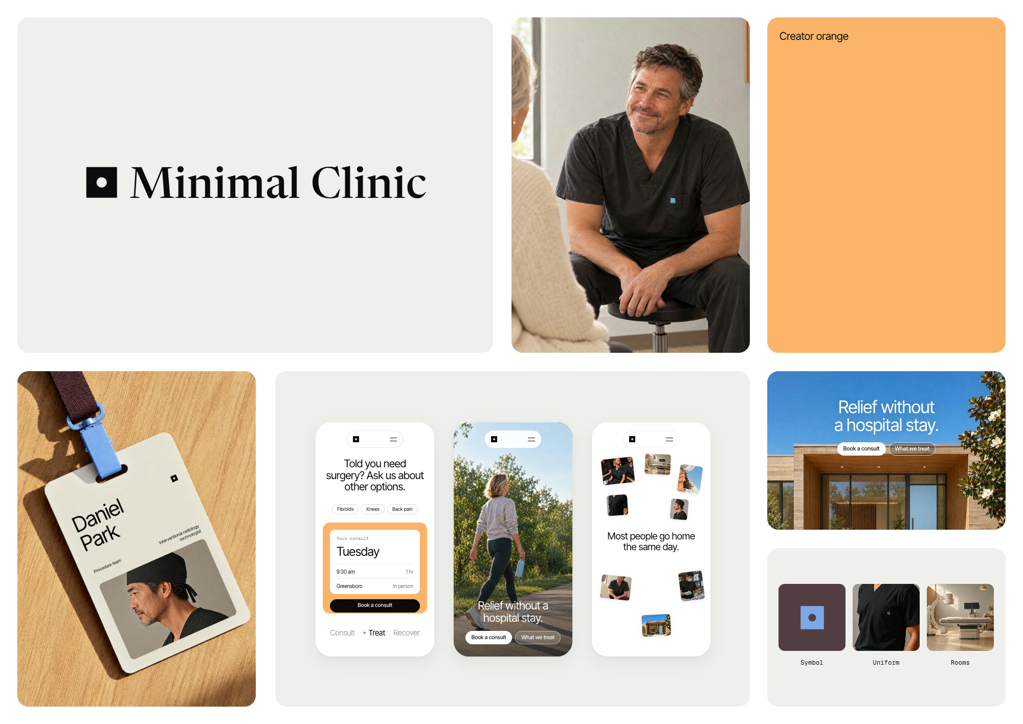
Every procedure here starts with one small opening, a needle or a thin tube. The mark is that opening, a circle cut into a square. The name is set in a serif made for reading, so the clinic sounds like a person talking, and everything around it stays in a quiet sans.
A soft palette that makes the clinic feel inviting.
Hospitals use white and blue to say clean. We went warm instead, a soft orange and a deep plum, because the people walking in are already nervous and the room should feel like it’s on their side. Light blue stays small, enough to say medicine without the chill.
Photos that feel warm and human, not sterile.
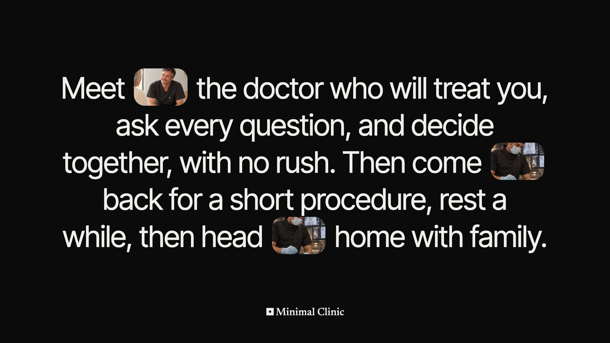
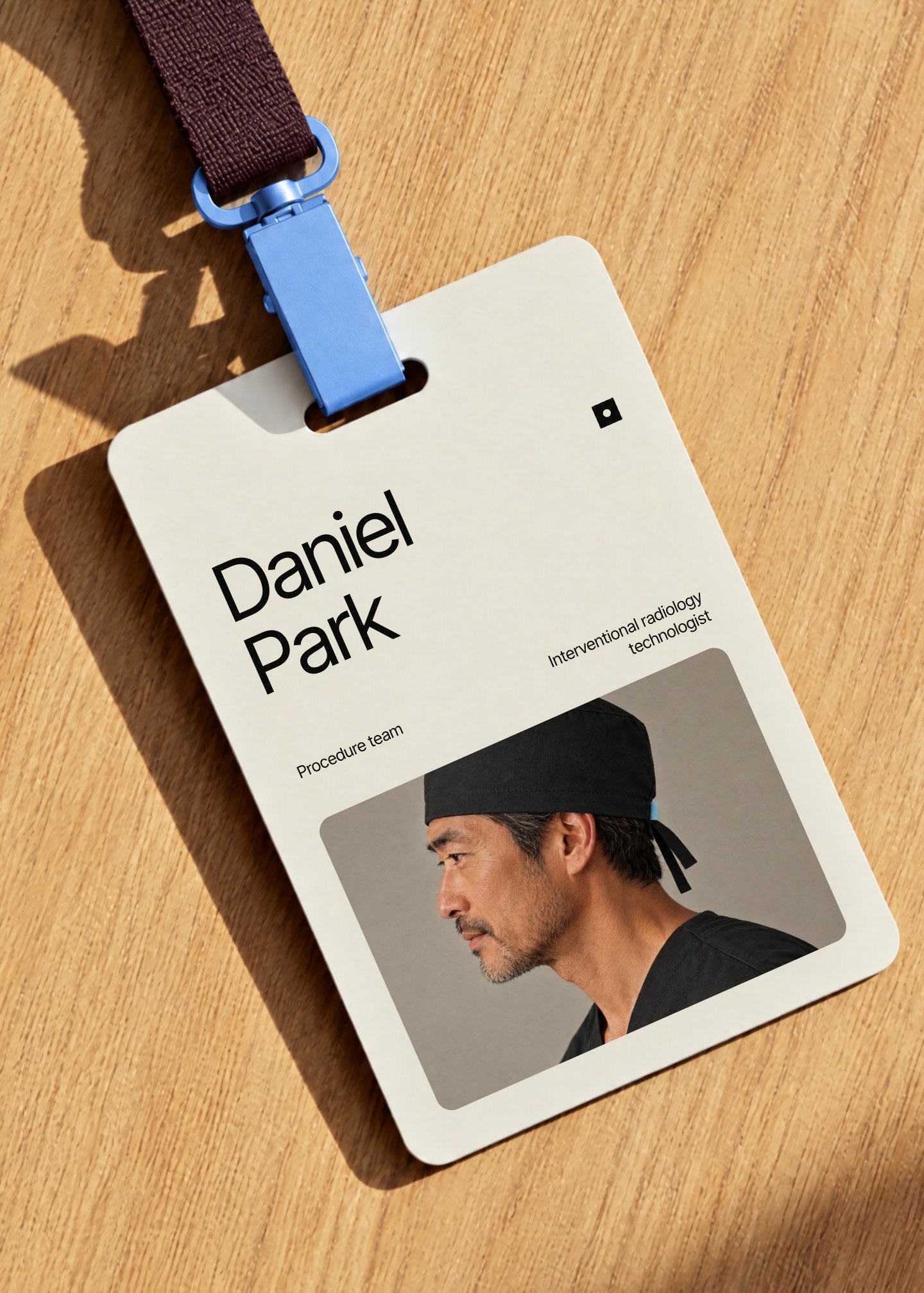
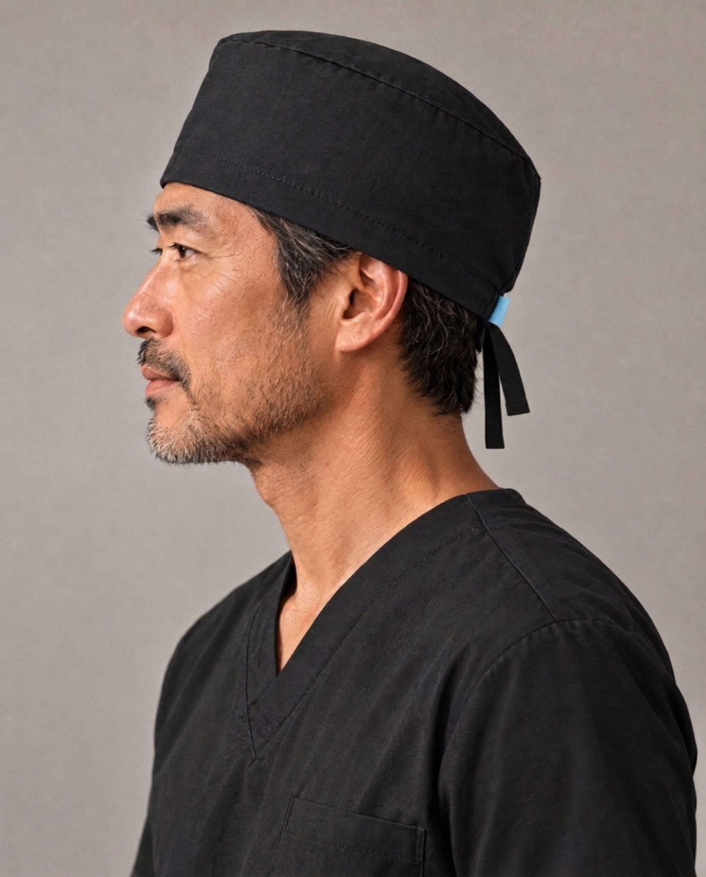
Clinic photos usually show the equipment, and the equipment is what scares people. These show the doctor sitting down to listen, the team laughing on a break, a patient back out on a walk. Every photo here was generated to set the direction for the real shoot.



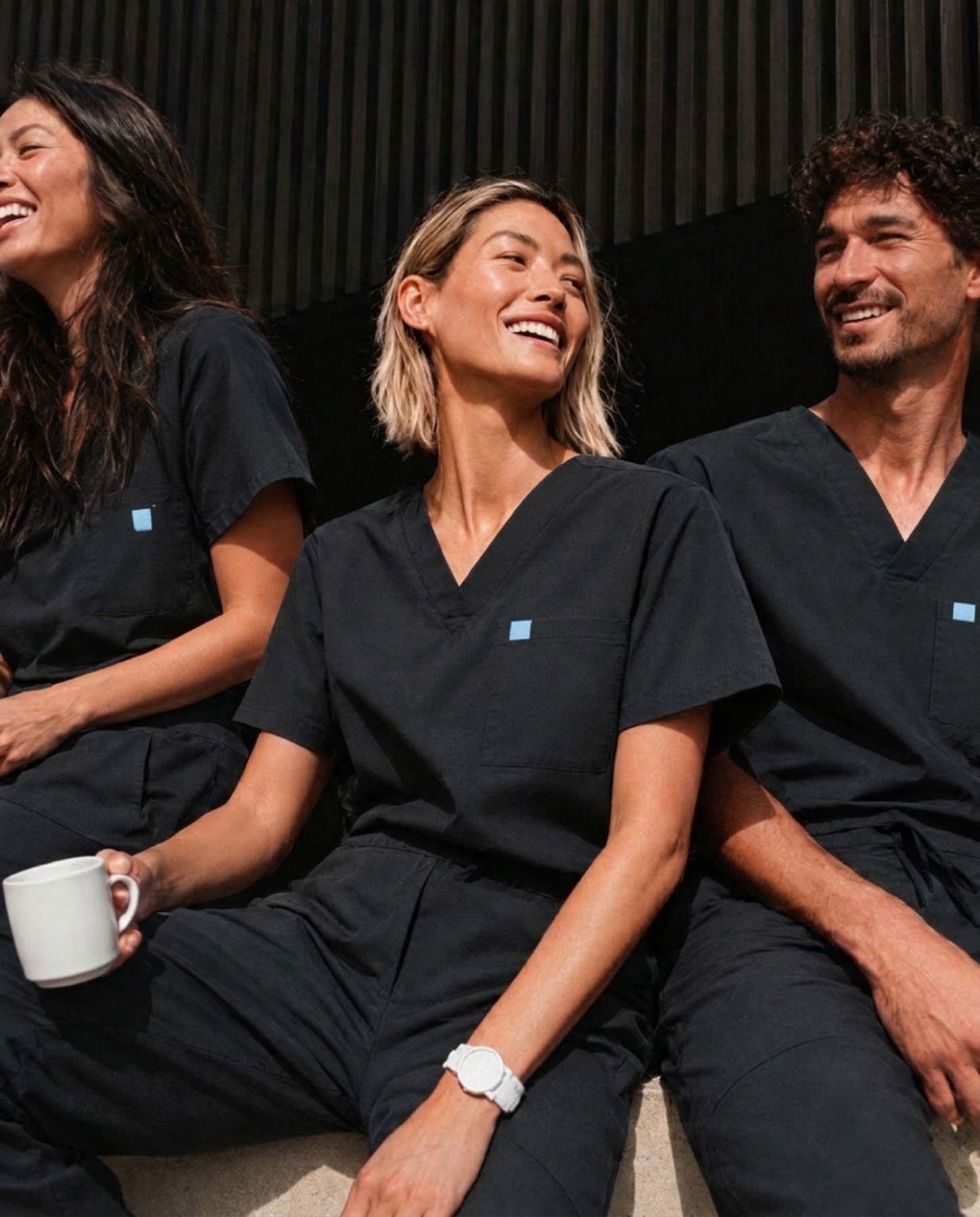
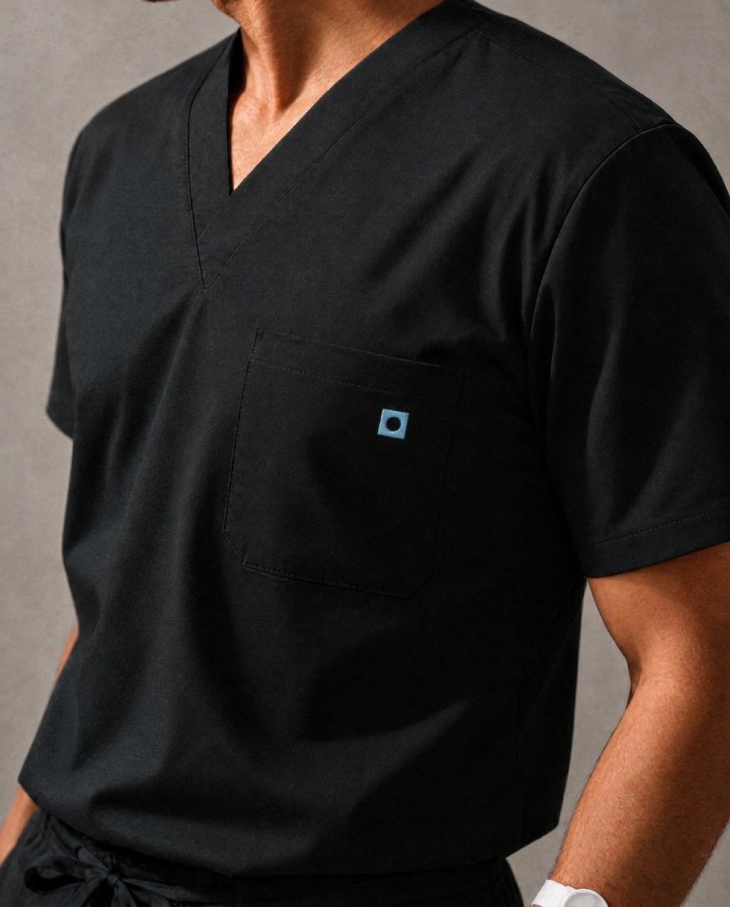
Built so the clinic can make its own posts.
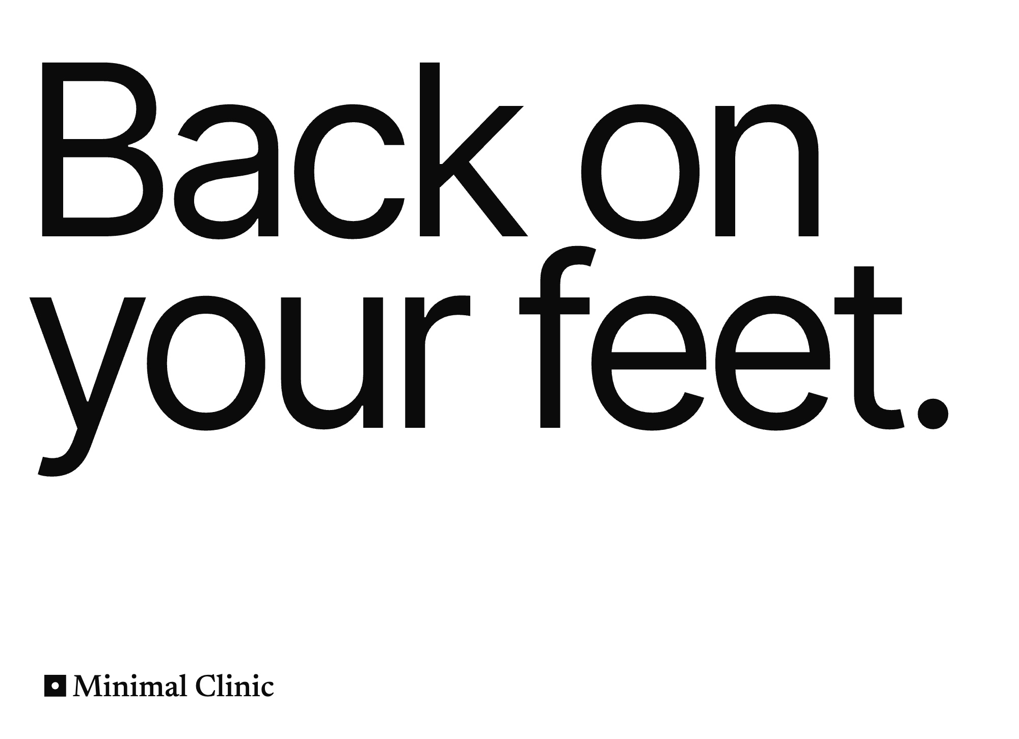
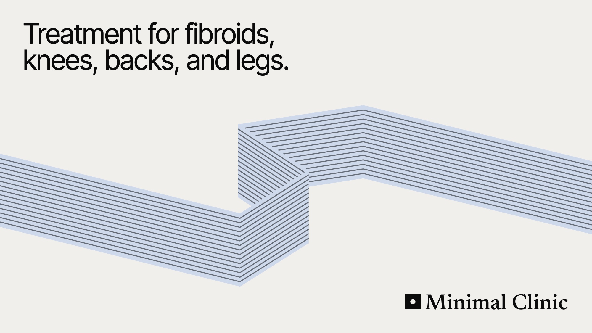
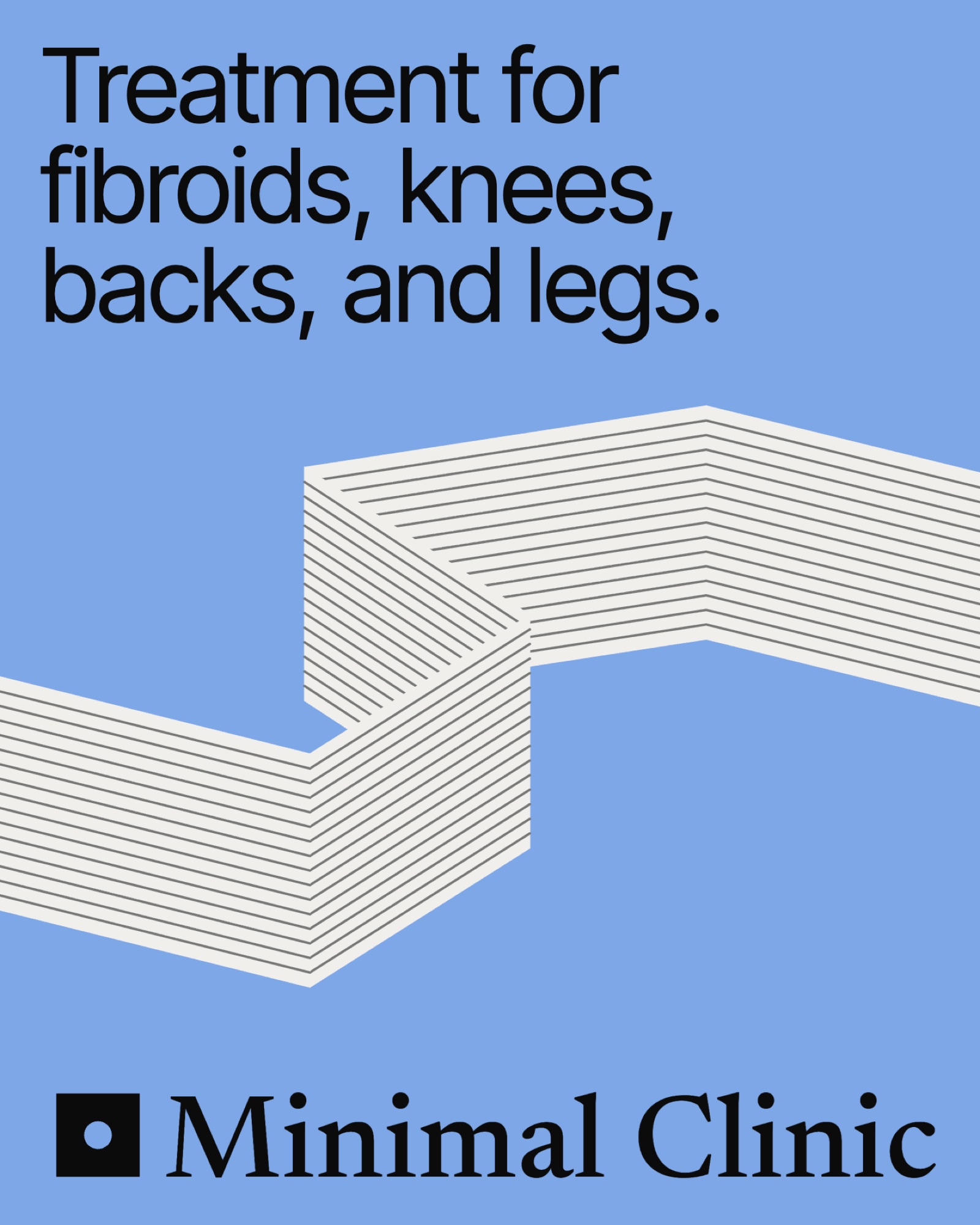
A small clinic doesn’t have a design team. So the brand comes as a set of layouts for statements, questions, lists, and photos, and the ribbon can run across any of them. Staff can make next month’s post without starting from a blank page.