Brands
Hinterland.
Early-stage venture capital for farm technology in the Midwest and Plains. We meet founders on the farm.
A venture firm that says plainly what it funds.
Concept work for a hypothetical venture firm that writes first checks to farm-tech founders in the Midwest and Plains. Most venture brands are built for Sand Hill Road. These founders are in Salina and Fargo, and they trust people who show up. So the brand looks like their land, talks like a neighbor, and says on every page what the firm funds.
- Name and mark
- Color
- Type
- Photography
- Layouts and templates
- Copy
Rows in a field, one left open.
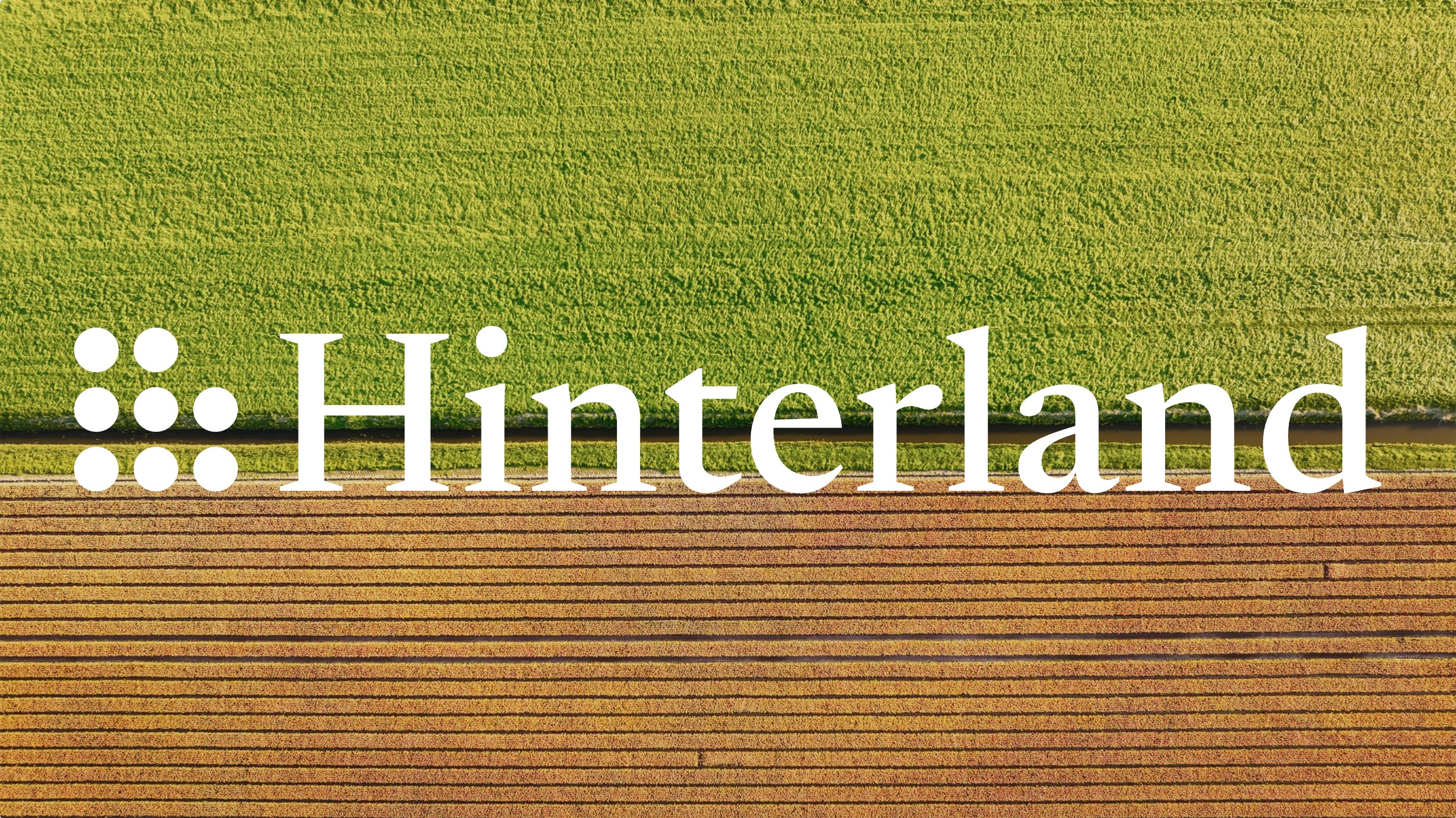
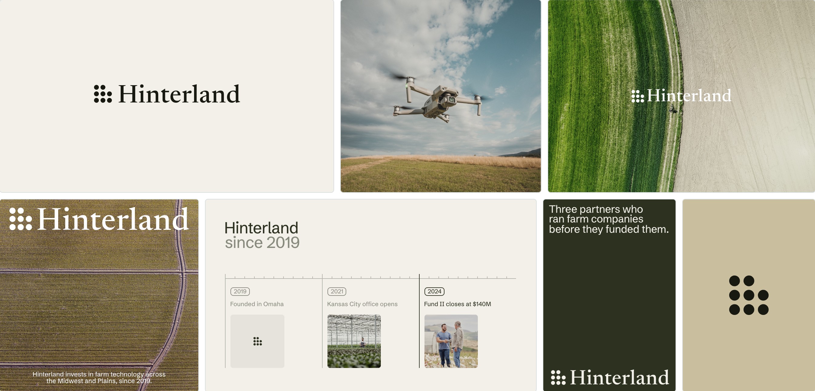
Plant a field in rows and you leave room for the next one. The mark is nine dots with one missing, the firm’s next investment. The name is in a classic serif, and the rest is in a sturdy grotesk that reads as well on a feed-store sign as in a pitch deck.

The colors of a field in late summer.
Every color came from aerial photos of farmland in August. The khaki is dry wheat, the deep green is a field after rain, and the bright green is a new crop, used sparingly so it still means something.
The land from above, and the people who work it.
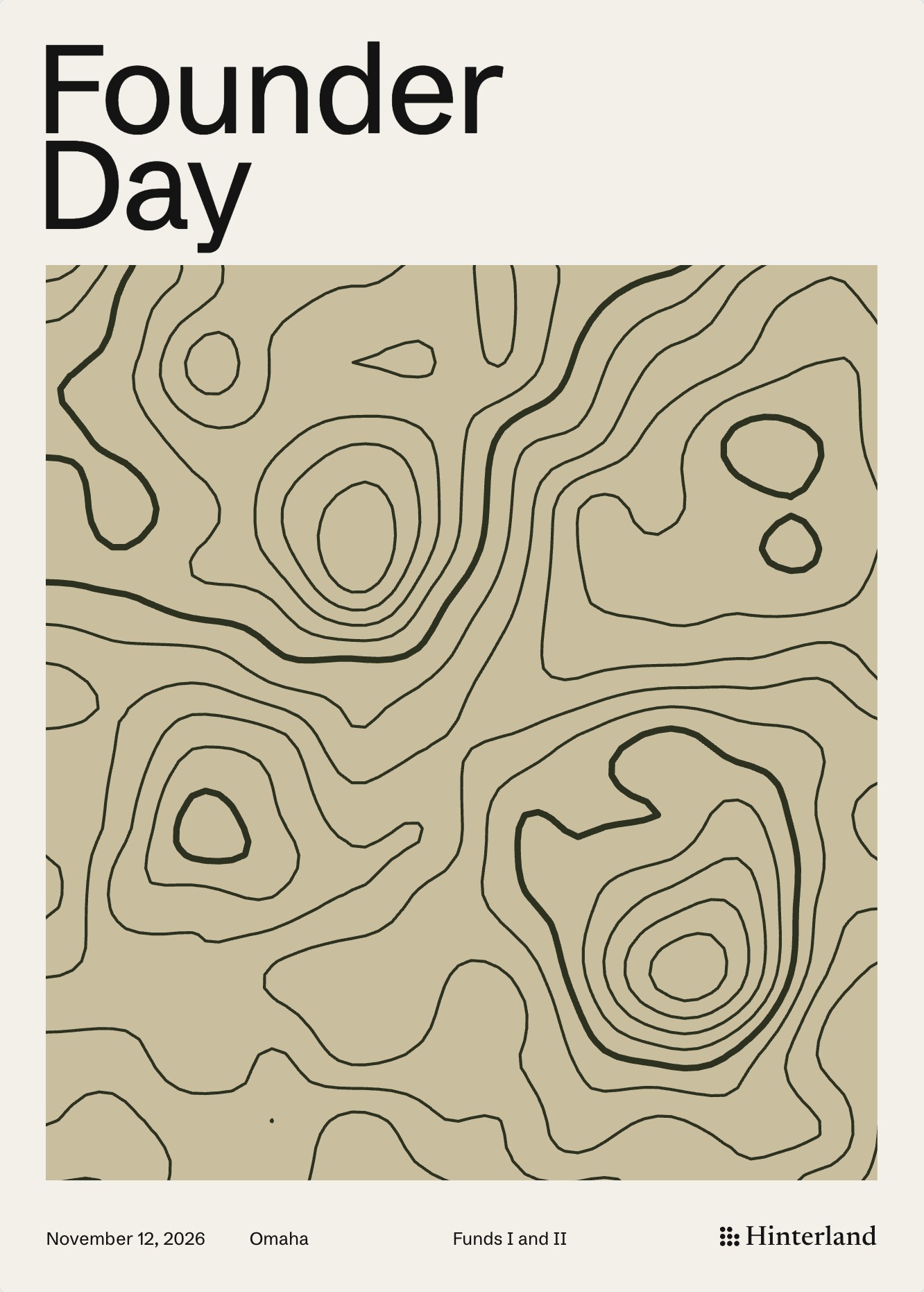
From the air, farmland looks like a map, and that’s the point, it shows where the money goes. On the ground, the photos stay with the founders and farmers, in the barn, the greenhouse, at the harvest. The firm backs people, and the photos say so. All licensed stock, chosen and graded for the brand.

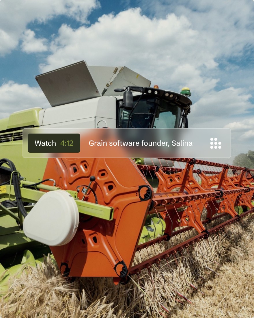

Every post starts with a place.
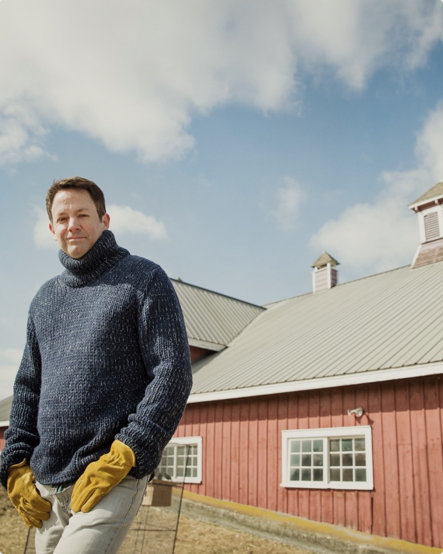
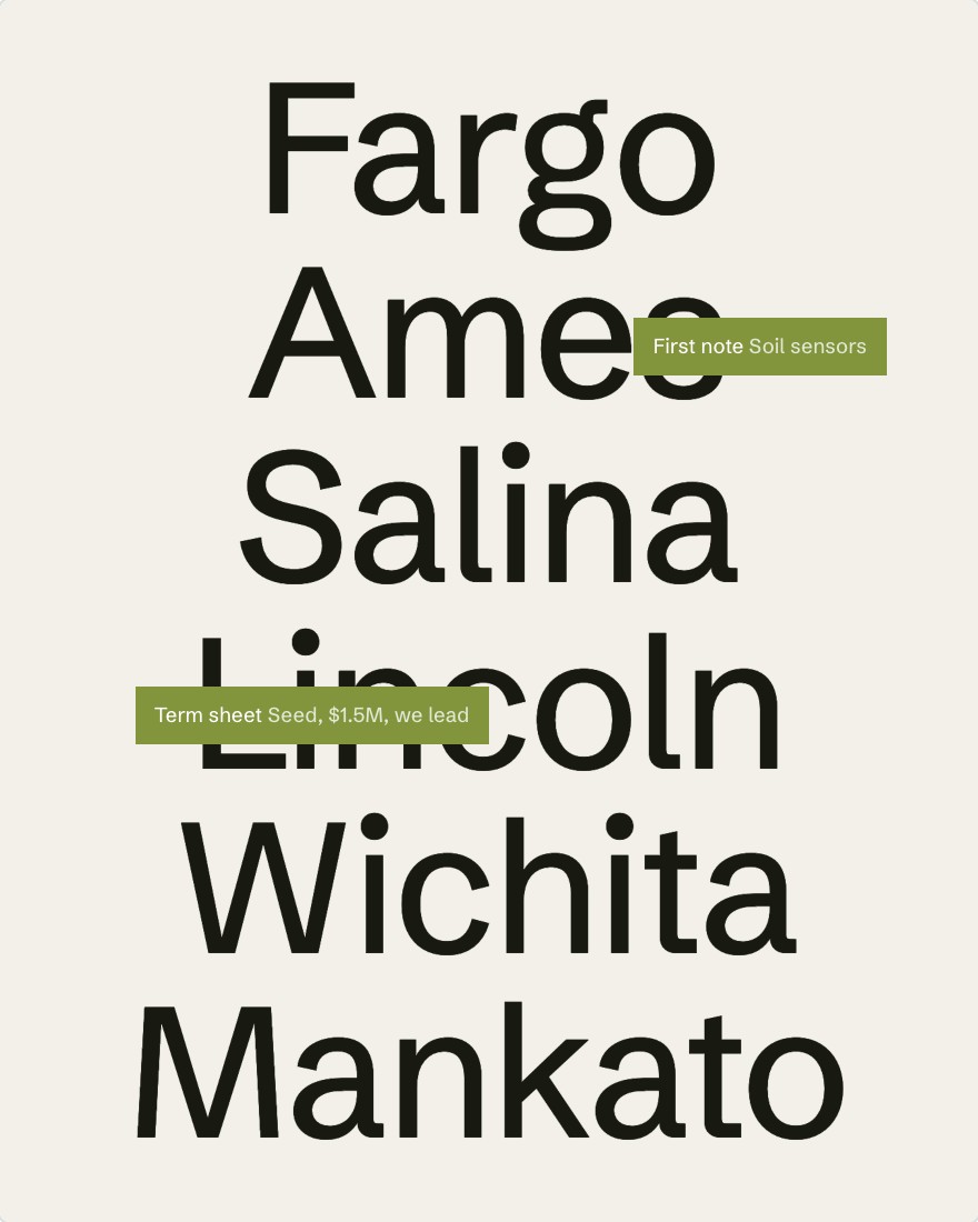
Founders out here want to know you’ve been where they are. So the layouts lead with towns, coordinates, and real numbers from the portfolio, and statements are set big and plain. A trail map’s contour lines are the only texture.
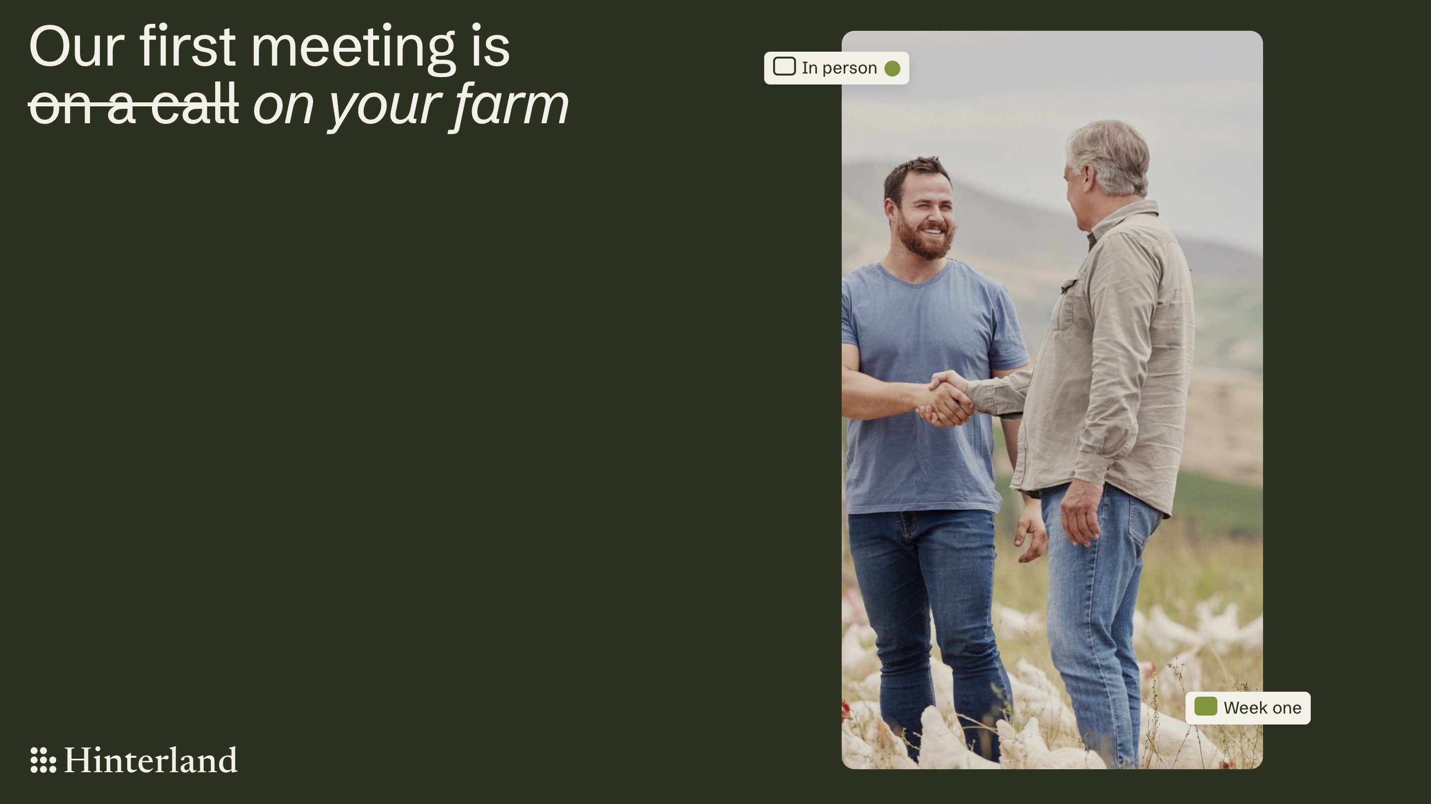


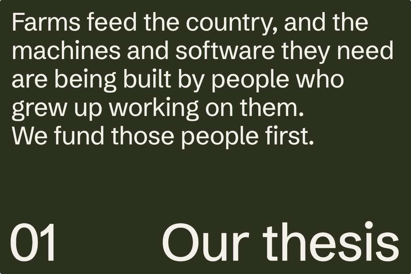
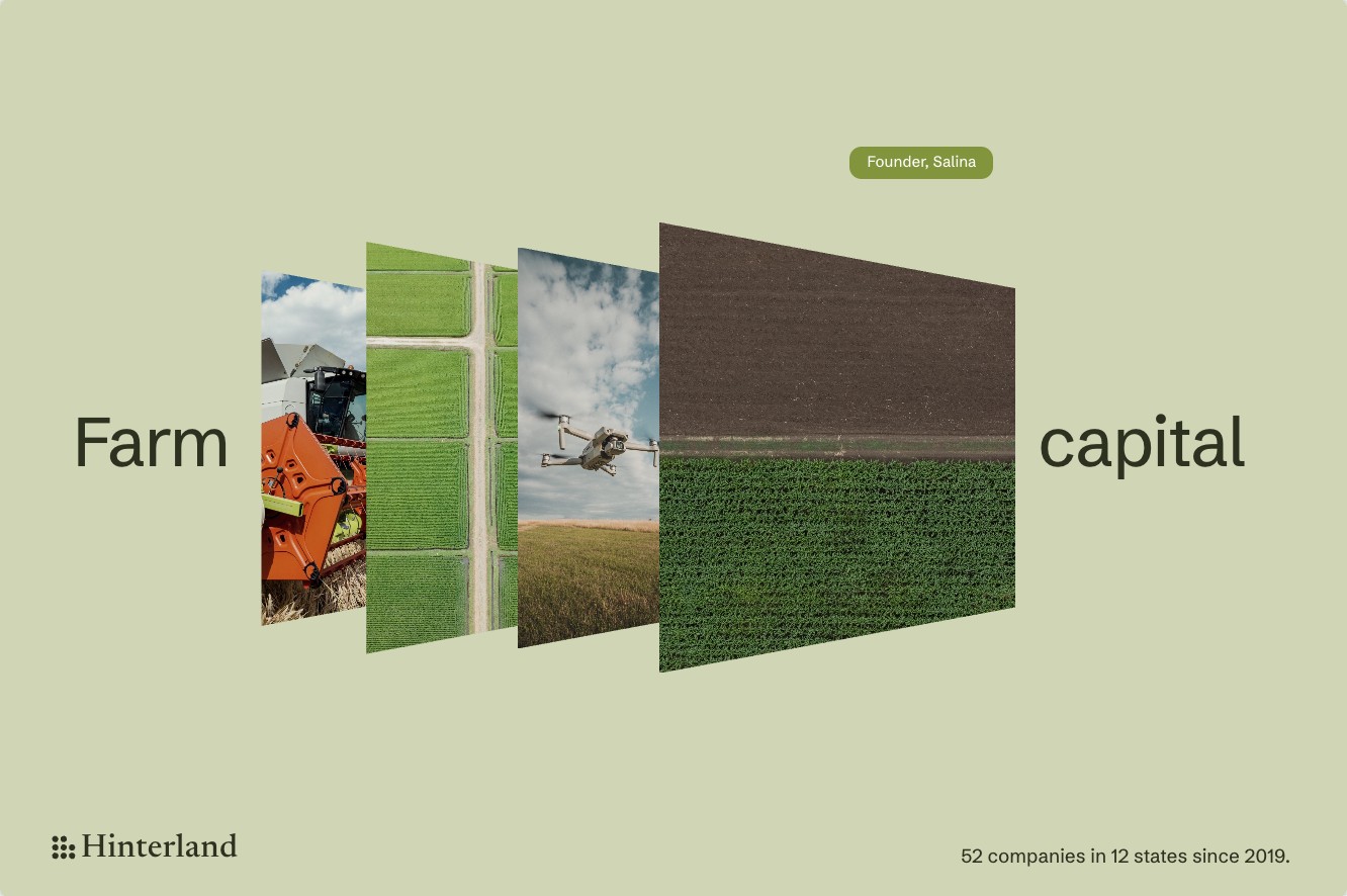
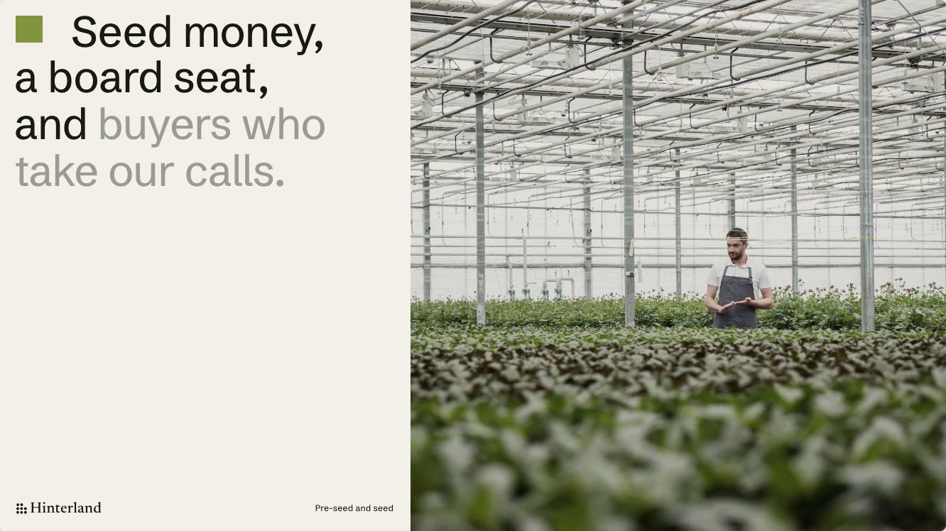
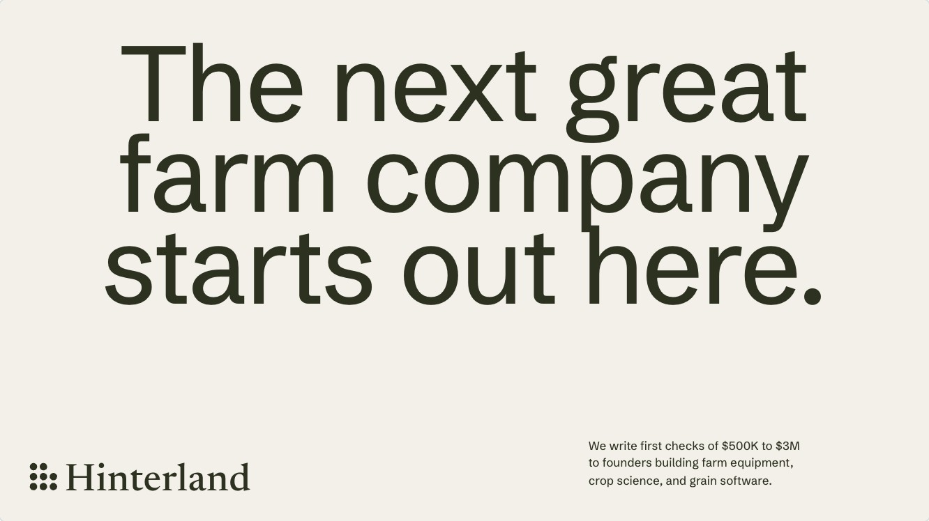
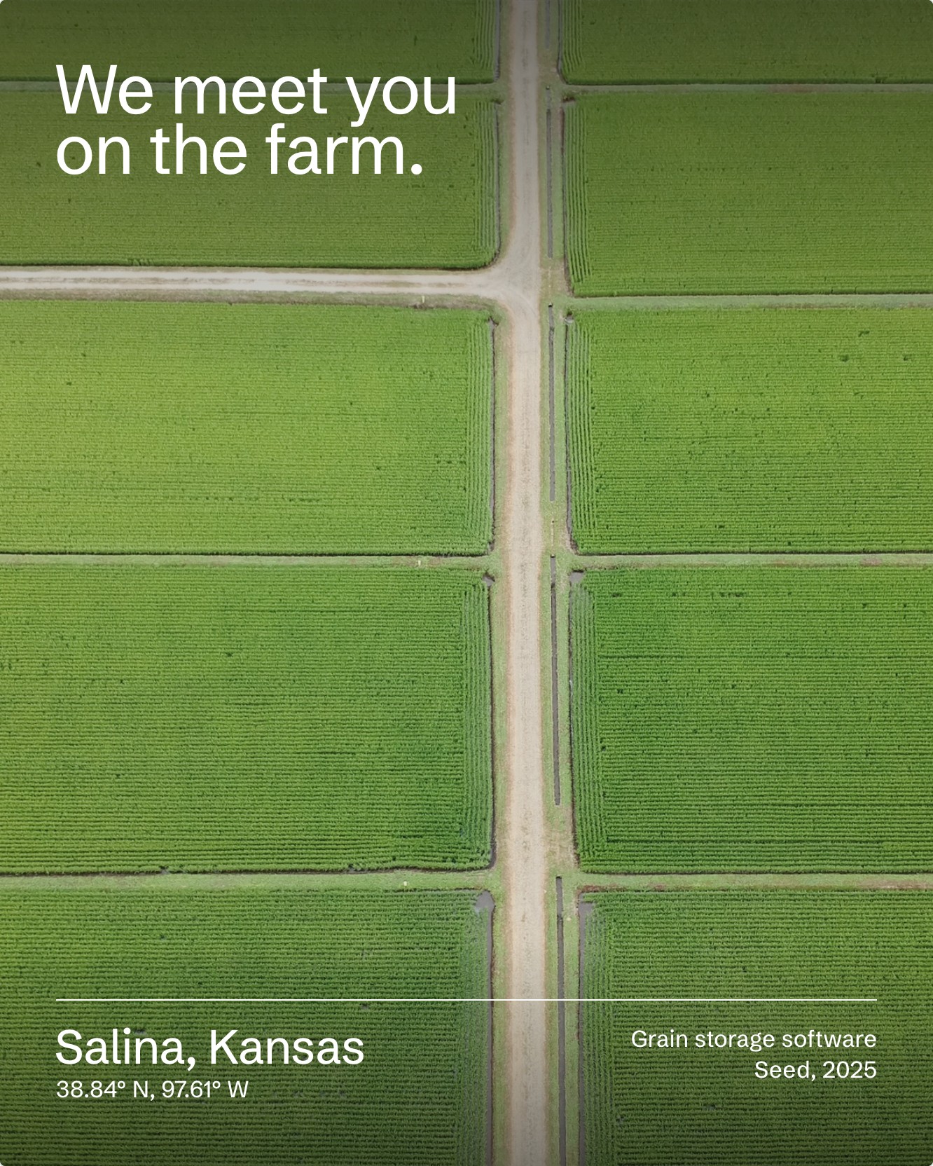
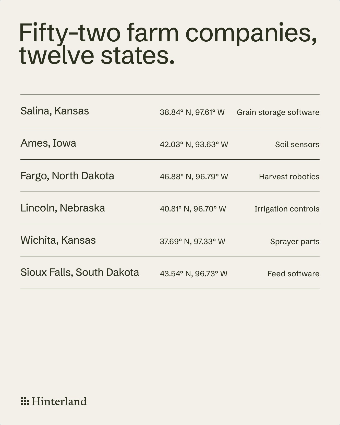
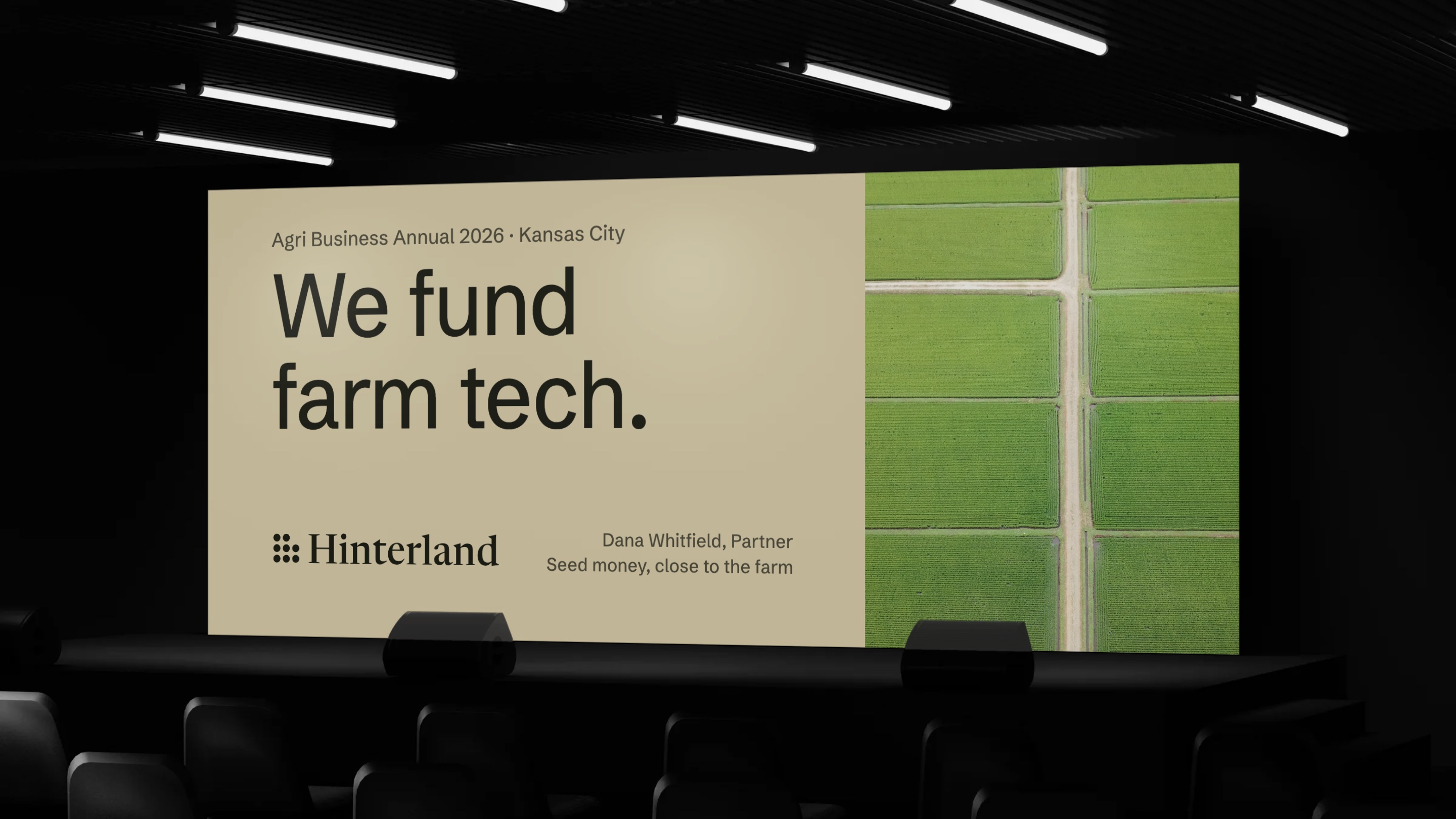
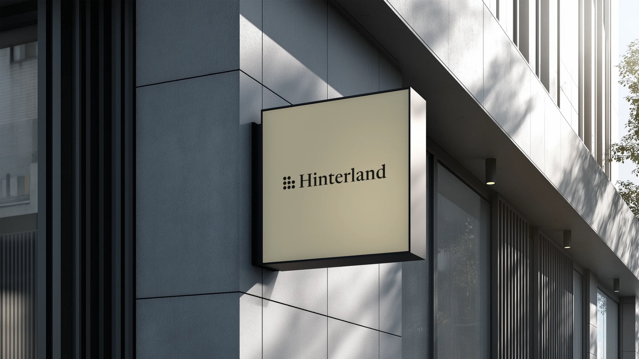
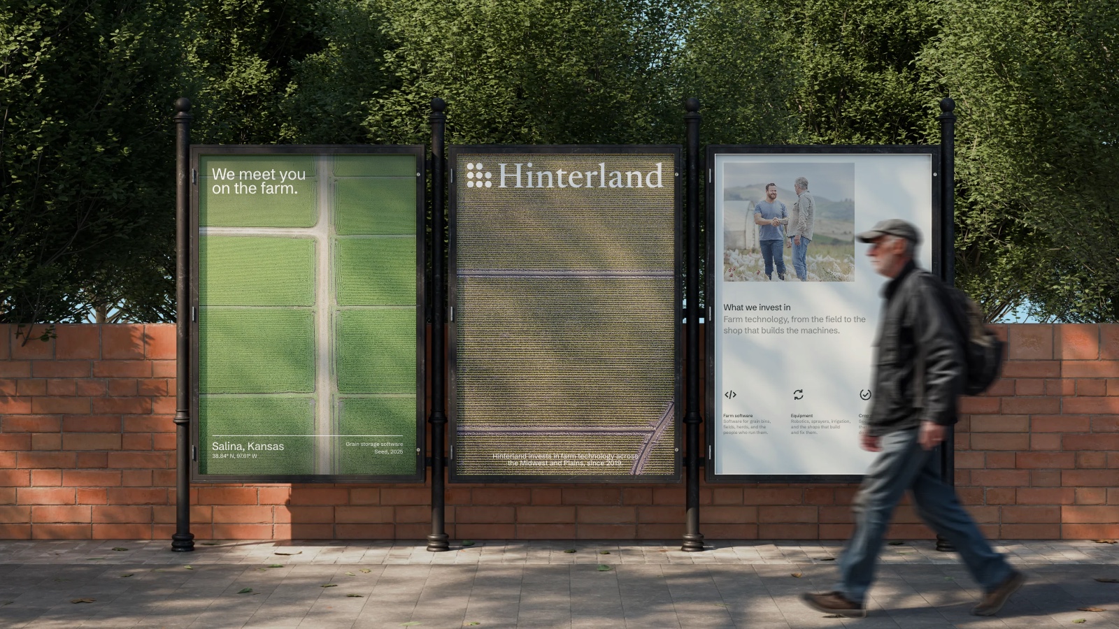
Built for a farm show as much as a pitch meeting.
The firm meets founders at conferences, on farms, and in small-town offices. The same few pieces hold up in all of them, the wordmark on a sign, a plain statement on a conference screen, posters on a brick wall.